In today's visually-driven market, food photography isn't just about making dishes look appetizing—it's a critical component of restaurant branding. A consistent visual identity across all touchpoints builds recognition, trust, and emotional connection with customers before they ever step through your door.
In this comprehensive guide, we'll explore how to develop and maintain a cohesive food photography style that strengthens your restaurant's brand and drives business results.
Why Visual Consistency Matters
Brand recognition requires consistency. When customers see your food photos—whether on Instagram, your website, delivery apps, or print menus—they should instantly recognize your restaurant's style. This consistency:
- Builds trust: Professional, consistent imagery signals quality and reliability
- Creates recognition: Customers identify your brand before reading your name
- Differentiates: A unique visual style sets you apart from competitors
- Reinforces positioning: Photography style communicates your price point and dining experience
Defining Your Visual Brand
Before shooting, define your restaurant's visual identity based on your brand positioning:
Brand Positioning Questions
- Mood: Is your restaurant casual and fun, or elegant and sophisticated?
- Audience: Who is your target customer? Families, couples, business diners?
- Experience: What feeling should customers have when dining with you?
- Values: What does your restaurant stand for? Local sourcing? Innovation? Tradition?
Visual Style Directions
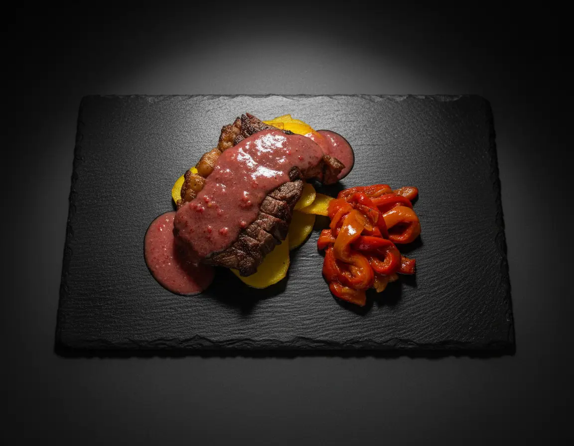
- Fine dining: Dark backgrounds, dramatic lighting, minimal props, artistic plating
- Casual comfort: Bright, warm lighting, lifestyle contexts, abundant portions
- Modern minimalist: Clean backgrounds, geometric composition, muted colors
- Rustic authentic: Natural textures, warm tones, handcrafted props, imperfect beauty
- Vibrant contemporary: Bold colors, dynamic angles, energetic styling
Creating Your Brand Style Guide
Document your visual standards to ensure consistency across all photography:
Color Palette
- Primary colors: 2-3 main colors that appear in props, backgrounds, or editing
- Accent colors: Colors that complement your primary palette for variety
- Colors to avoid: Hues that clash with your brand or make food unappetizing
- Color temperature: Overall warm or cool tone for your imagery
Lighting Standards
- Light quality: Soft and diffused, or hard and dramatic?
- Light direction: Side lighting, backlighting, or overhead?
- Shadow intensity: Deep shadows for drama or filled shadows for brightness?
- Highlight style: Specular highlights on glossy foods or matte, even lighting?
Props and Surfaces
- Plate styles: Specific shapes, colors, and materials
- Background surfaces: Approved materials (wood, marble, concrete, etc.)
- Utensils: Consistent cutlery style (vintage, modern, minimal)
- Textiles: Napkin colors, textures, and folding styles
Consistency Across Platforms
Your visual brand must translate effectively across different contexts:
Social Media
Maintain your style while adapting to platform requirements. Your Instagram feed should have a cohesive look when viewed as a grid, with consistent colors, tones, and composition patterns.
Website and Digital Menus
High-resolution images that match your brand aesthetic. Consider how photos interact with your website design, text overlays, and overall user experience.
Delivery Platforms
Adapt your style to platform requirements (specific aspect ratios, bright lighting for small thumbnails) while maintaining brand recognition.
Print Materials
Physical menus, flyers, and advertisements require higher resolution and may need different cropping. Ensure print colors match your digital presence.
Editing for Brand Consistency
Post-processing is where brand consistency is solidified:
- Presets and filters: Create or purchase editing presets that define your look
- Color grading: Apply consistent color adjustments to all images
- Exposure standards: Maintain consistent brightness and contrast levels
- White balance: Keep color temperature consistent across all photos
Photographing for Different Brand Tiers
Quick Service Restaurants
- Bright, energetic lighting
- Clean, simple backgrounds
- Focus on value and portion size
- Lifestyle shots showing enjoyment
Casual Dining
- Warm, inviting atmosphere
- Context and lifestyle elements
- Emphasis on sharing and experience
- Balance of food beauty and accessibility
Fine Dining
- Dramatic, artistic lighting
- Minimalist, refined styling
- Focus on technique and presentation
- Premium props and surfaces
Maintaining Consistency Over Time
Brands evolve, but changes should be intentional and gradual:
- Document everything: Keep detailed records of camera settings, editing presets, and prop sources
- Train your team: Ensure anyone creating content understands and can execute your visual standards
- Regular audits: Periodically review all visual content for consistency
- Evolve intentionally: When updating your style, make gradual shifts rather than sudden changes
Measuring Brand Photography Success
Track how your visual branding performs:
- Engagement rates: Do branded images outperform inconsistent ones?
- Recognition: Can customers identify your restaurant from photos alone?
- Conversion: Do consistent visuals drive more orders and reservations?
- Brand recall: Survey customers about visual brand recognition
Conclusion
Building a strong restaurant brand through food photography requires strategy, consistency, and attention to detail. When your visual identity is cohesive across every touchpoint, customers develop trust and recognition that translates directly to loyalty and revenue.
Start by defining your brand's visual direction, document it in a style guide, and commit to consistency in every photo you share. Over time, your distinctive visual style becomes an invaluable asset that sets you apart in a crowded market.