Color is one of the most powerful tools in food photography. Before a viewer consciously processes what they're seeing, color has already triggered emotional and physical responses. The right color combinations can make food look fresh, appetizing, and irresistible. The wrong colors can make even delicious dishes look unappetizing.
Understanding color theory isn't just for artists and designers. It's essential knowledge for anyone serious about food photography. This guide will teach you how to harness the power of color to create food images that truly connect with viewers.
The Psychology of Food Colors
Different colors trigger different psychological and physiological responses. Understanding these associations helps you make intentional choices in your food photography:
Warm Colors: Appetite Stimulants
- Red: The most powerful appetite stimulant. Red increases heart rate and creates urgency. It's no accident that many restaurant brands use red in their logos. In food, red suggests ripeness, sweetness, and bold flavor.
- Orange: Evokes warmth, comfort, and energy. Orange foods appear healthy and vitamin-rich. It's associated with citrus freshness and autumn harvests.
- Yellow: Suggests happiness, optimism, and energy. Golden-brown colors indicate caramelization and rich flavor. Yellow can also suggest butter, cream, and richness.
Cool Colors: Freshness and Calm
- Green: The universal symbol of freshness, health, and nature. Green vegetables signal nutrition and vitality. Bright greens suggest crispness and just-picked quality.
- Blue: Interestingly, blue is an appetite suppressant in food itself (few natural foods are blue). However, blue backgrounds or plates can make warm-colored foods pop dramatically.
- Purple: Associated with luxury, creativity, and uniqueness. Purple foods (berries, eggplant, purple cabbage) can add striking visual interest and suggest antioxidant richness.
Neutral Colors: The Foundation
- White: Suggests purity, cleanliness, and simplicity. White plates are popular because they don't compete with food colors and make dishes look fresh.
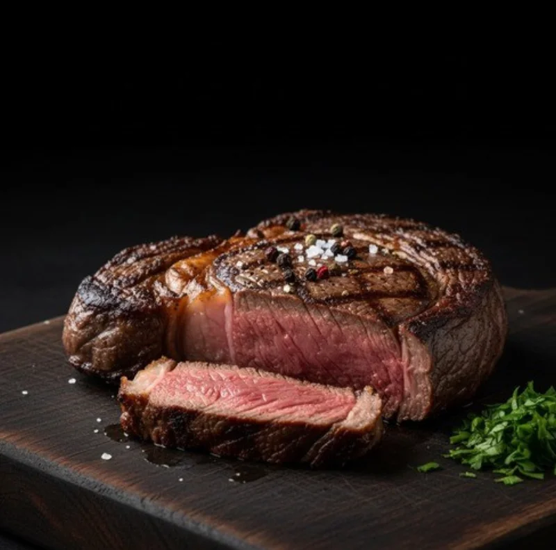
- Black: Creates drama, sophistication, and luxury. Black backgrounds or plates make colors appear more vibrant and can create a moody, upscale feel.
- Brown: Evokes earthiness, comfort, and natural ingredients. Brown tones in backgrounds suggest rustic authenticity and artisanal quality.
Understanding the Color Wheel
The color wheel is your roadmap to creating harmonious and impactful color combinations. Here are the key relationships:
Complementary Colors
Colors directly opposite each other on the color wheel create the highest contrast and visual impact. These combinations make both colors appear more vibrant:
- Red and Green: Tomatoes on a bed of basil, strawberries with mint, red peppers with green herbs.
- Orange and Blue: Citrus fruits on blue plates, sweet potato against blue-gray backgrounds, carrots with blue cheese.
- Yellow and Purple: Lemon with lavender, corn with purple cabbage, eggs with purple basil.
Pro tip: Complementary colors are powerful but can be overwhelming. Use them in a 70/30 or 80/20 ratio, with one color dominating and the other as an accent.
Analogous Colors
Colors next to each other on the color wheel create harmonious, cohesive compositions. These combinations feel natural and pleasing:
- Red, Orange, Yellow: Autumn-inspired compositions, warm comfort foods, sunset-themed presentations.
- Green, Yellow-Green, Yellow: Fresh salads, spring vegetables, citrus-herb combinations.
- Blue, Purple, Pink: Berry-focused compositions, floral desserts, wine and grape pairings.
Triadic Colors
Three colors equally spaced on the color wheel create vibrant, balanced compositions. These are more complex but very visually striking when done well:
- Red, Yellow, Blue: Primary colors create bold, energetic images perfect for casual dining.
- Orange, Green, Purple: Fresh and dynamic, great for vegetable-forward dishes.
Practical Color Applications
Choosing Backgrounds and Props
Your background and prop colors should support, not compete with, your food:
- Neutral backgrounds (white, gray, black, natural wood) work with almost any food and let the dish be the star.
- Complementary background colors can make your food pop dramatically but require careful balance.
- Analogous prop colors create cohesive, sophisticated looks that don't distract from the food.
Adding Color Through Garnishes
Garnishes are your secret weapon for introducing missing colors and creating visual balance:
- Green herbs: Add freshness to any warm-colored dish. Basil, parsley, cilantro, and microgreens are versatile additions.
- Citrus: Lemon or lime adds bright yellow or green pops that suggest freshness and acidity.
- Edible flowers: Purple, pink, or orange flowers can add striking color accents to desserts and salads.
- Spices: Paprika, turmeric, or black pepper can add color contrast while suggesting flavor.
Color Temperature and Mood
Beyond individual colors, the overall color temperature of your image creates mood:
- Warm color temperatures (golden, amber tones) create feelings of comfort, nostalgia, and appetite. Perfect for comfort food, baked goods, and autumn-inspired dishes.
- Cool color temperatures (blue-white tones) create feelings of freshness, cleanliness, and modernity. Ideal for seafood, salads, and health-focused presentations.
- Neutral color temperatures accurately represent food colors and work for versatile, commercial applications.
Common Color Mistakes to Avoid
- Too many competing colors: More than 3-4 distinct colors can feel chaotic. Choose a focused color palette.
- Unnatural color casts: Green tints make food look spoiled. Blue tints make food look cold and unappetizing. Watch your white balance.
- Over-saturated colors: Pushing saturation too far in editing makes food look artificial and untrustworthy.
- Ignoring the plate: The wrong plate color can clash with your food or make it look less appealing. When in doubt, use white.
- Forgetting contrast: Beige food on a beige background disappears. Ensure sufficient contrast between food and surroundings.
Building Your Color Toolkit
Professional food photographers collect props and backgrounds in strategic colors:
- Essential neutrals: White plates, black slate, natural wood surfaces, gray linen napkins.
- Complementary options: Blue plates for warm foods, green surfaces for red foods.
- Texture variety: Different materials (ceramic, wood, marble, fabric) in your color palette add visual interest.
Conclusion: Color as Your Secret Weapon
Color theory might seem academic, but its applications are deeply practical. The difference between a food photo that gets scrolled past and one that makes someone stop and feel hungry often comes down to color choices.
Start by observing the food photos that catch your eye and analyzing their color relationships. Practice shooting the same dish with different colored backgrounds and props. Over time, color-conscious composition will become instinctive.
Remember: you're not just photographing food. You're creating an emotional experience through color. Make every hue count.